Oleva
Designing a Patient-Centered Healthcare Portal for English-Speaking Women in Israel
Project Summary
Background
Israel offers excellent, affordable healthcare, but for English-speaking immigrants, pregnancy and postpartum care often feels fragmented, confusing, and stressful due to language barriers and disconnected systems.
Missed appointments, unclear instructions, and poor communication aren’t edge cases. They’re common.
The Opportunity
How might we give English-speaking women a single, reliable place to manage pregnancy care without forcing them to navigate multiple Hebrew-only systems?
The Product Strategy
Oleva is a B2B SaaS, white-label patient portal that centralizes pregnancy care into a single, English-first experience for Israel’s healthcare system.
Product Type
Concept- B2B SaaS (Patient portal)
Timeframe
8 weeks
My Role
Product Designer (UX/UI)
Tools
Figma
Fig Jam
Otter AI
Maze
Starting with Research
User interviews revealed recurring user pain points for English-speaking women navigating pregnancy care in Israel, particularly around language barriers, fragmented systems, and low confidence in decision-making.
Competitor Analysis
A competitive review of pregnancy apps and Israeli Kupah platforms highlighted a clear gap between generic pregnancy tracking tools and inaccessible, Hebrew-only healthcare systems.
User Flow
After finishing the research, I mapped out the main user flows to get a clear sense of how people would move through the product before jumping into wireframes.
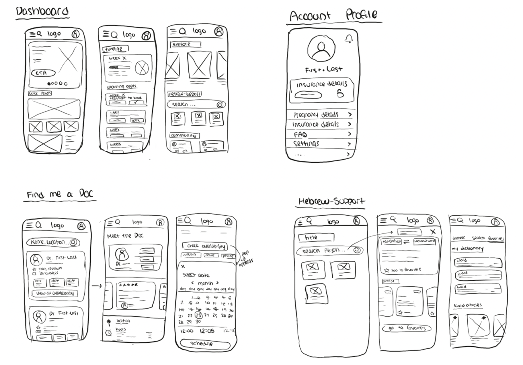
Low-Fidelity Wireframes
These early sketches helped me quickly explore structure, user flow, and core functionality without getting attached to visual details.

Mid-Fidelity Wireframes
As the project evolved, I stepped back and re-evaluated the solution, ultimately shifting to a web app experience that better supported the product’s complexity, scalability, and user workflows.
The Experience
Dashboard: A Clear Starting Point
The dashboard is designed to reduce cognitive load by surfacing only what matters right now: tasks, appointments, messages, and progress.
Quick Actions: Reducing Friction at Any Moment
A persistent Quick Actions menu allows users to complete the most common tasks, booking, messaging, uploading documents, from anywhere in the app.
Finding the Right Provider
Finding a provider who speaks your language and understands your needs is a major pain point in Israeli healthcare.
Oleva prioritizes discovery before booking, allowing users to confidently evaluate providers before taking action.
Booking Without Guesswork
Once a user decides to book, scheduling happens directly within Oleva. No redirects, Hebrew-only forms, or unclear steps.
The flow is intentionally progressive: learn first, book second.
Message & Document Accesibility
The inbox brings messages, referrals, and documents into one place with in-app translation built directly into the experience.
Users can read, review, and translate important medical information without leaving the app or relying on external tools.
Branding Oleva
The name "Oleva" reflects the company’s mission beautifully. A blend of "Oleh" (immigrant) and "Lev" (heart), it symbolizes the care, love, and guidance the app provides to Olim as they navigate their healthcare journeys in Israel.
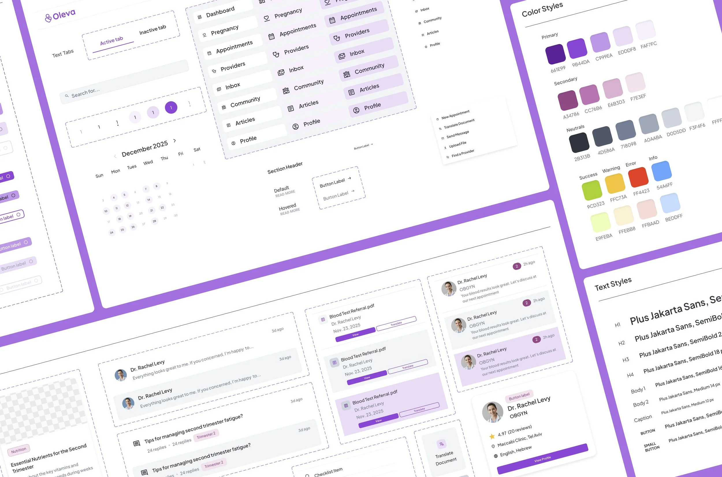
Design System

Oleva’s design system was built from scratch to support a calm, trustworthy healthcare experience while remaining flexible for white-label use across insurance companies.
Reflection
Designing Oleva meant balancing empathy with restraint. It was creating a system that supports users without overwhelming them during an already sensitive time.
This project sharpened my approach to healthcare UX, complex systems, and designing for trust at scale.
Next Steps
Design the insurance company admin dashboard for managing providers, content, and patient communications
Explore multilingual support beyond English, while maintaining an English-first core experience
Define success metrics around patient satisfaction, reduced support requests, and booking completion rates
