Frempco

Responsive Website Design

Project Summary

Mission

The Frempco website redesign project was driven by a mission to align the online presence with the company’s core values: Friendship, Empowerment, Community, and Education. 

Frempco’s role-playing workshops are designed to transform classrooms into spaces of connection and collaboration, yet the previous website failed to reflect this vibrancy and purpose. The outdated design, scattered information, and poor user experience created a barrier between Frempco and the educators it was trying to serve.

The Problem

Frempco’s existing website did not convey the sense of belonging or the engaging, transformative nature of its workshops. Potential clients were struggling to understand Frempco’s unique offerings, accessing resources, or feeling inspired to take action. The site lacked cohesion and failed to communicate the values that made Frempco stand out as a leader in role-playing education. Without a strong digital presence, Frempco risked losing valuable opportunities to reach new audiences and build its community.

The Goal

The goal of this project was to understand how English and History teachers teach their content and engage students using technology, enabling us to design an intuitive platform that enhances their ability to create interactive role-playing activities. By addressing teachers’ workflows, challenges, and needs, Frempco would be an effective tool for fostering deeper student engagement and understanding of literature and history.

Timeframe

4 weeks (June 2025)

My Role

Product Designer

Skills

  • Research

  • User flows

  • Wireframing

  • Visual design

  • Branding

  • Prototyping

  • Usability Testing

  • Developer Handoff

Tools

  • Figma

  • Fig Jam

  • Zoom

  • Maze

Product at a Glance

Before Redesign

After Redesign

Starting with Research

At this early stage of Frempco’s development, the research focused on understanding both the experiences of current users and the needs of potential users- English and history teachers. This dual approach aimed to uncover insights into how teachers perceive technology, games, and classroom community, as well as their expectations for tools that enhance engagement and interactivity in the classroom.

User Interviews

Through interviews with current and potential Frempco users, I uncovered valuable insights into their experiences and challenges. The analysis of interviews in addition to affinity mapping revealed key themes, shedding light on shared pain points and unmet needs.

Competitor Analysis

A competitor analysis was performed to understand how similar platforms approached this space, identify gaps in their offerings, and gather inspiration for best practices. This helped clarify what Vendirect needed to do differently to truly stand out and solve unmet needs.

Initially, we assumed platforms like Kahoot would be our main competition. However, we soon realized that Frempco’s niche focus and early stage of development set it apart, and for our MVP, we were primarily competing with other specialized educational tools like Blooket that target similar educator audiences.

Who are We Designing For?

A range of teachers were interviewed, including those teaching English as a First Language (EFL) students and those working with English as a Second Language (ESL) learners. After consulting with stakeholders, we decided to focus our typical user persona on EFL teachers, as their use of Frempco differs significantly. Wwhile ESL teachers often use it as a fun conversational game, EFL teachers’ students can fully benefit from the platform’s potential to build community and foster deeper classroom connections beyond language skills.

Bridging Research to Action

Following the research phase, I focused on aligning user needs with business objectives to guide Frempco’s development. By identifying shared goals, I ensured the platform would meet the needs of teachers and students while supporting Frempco’s growth in the ed-tech space.

Defining Frempco’s Edge

This case study focused specifically on redesigning the teacher’s dashboard, a relatively straightforward task centered on improving usability without reinventing the wheel. The real creative challenge was developing features for the game room chat, where an innovative design was essential to enhance teacher interaction within the platform. 

The following were the key features we prioritized first, as they were crucial to delivering a successful MVP.

Sitemap

With features prioritized, a sitemap would outline all the elements contained within the dashboard, providing clarity on how the different features would be organized and interconnected. Features relevant to this project were highlighted, while those designated by stakeholders for future development were grayed out, ensuring a clear distinction between immediate priorities and upcoming enhancements.

Exploring the Flow

After laying the foundation, the next step was transforming plans into design.

Focused Wireframing

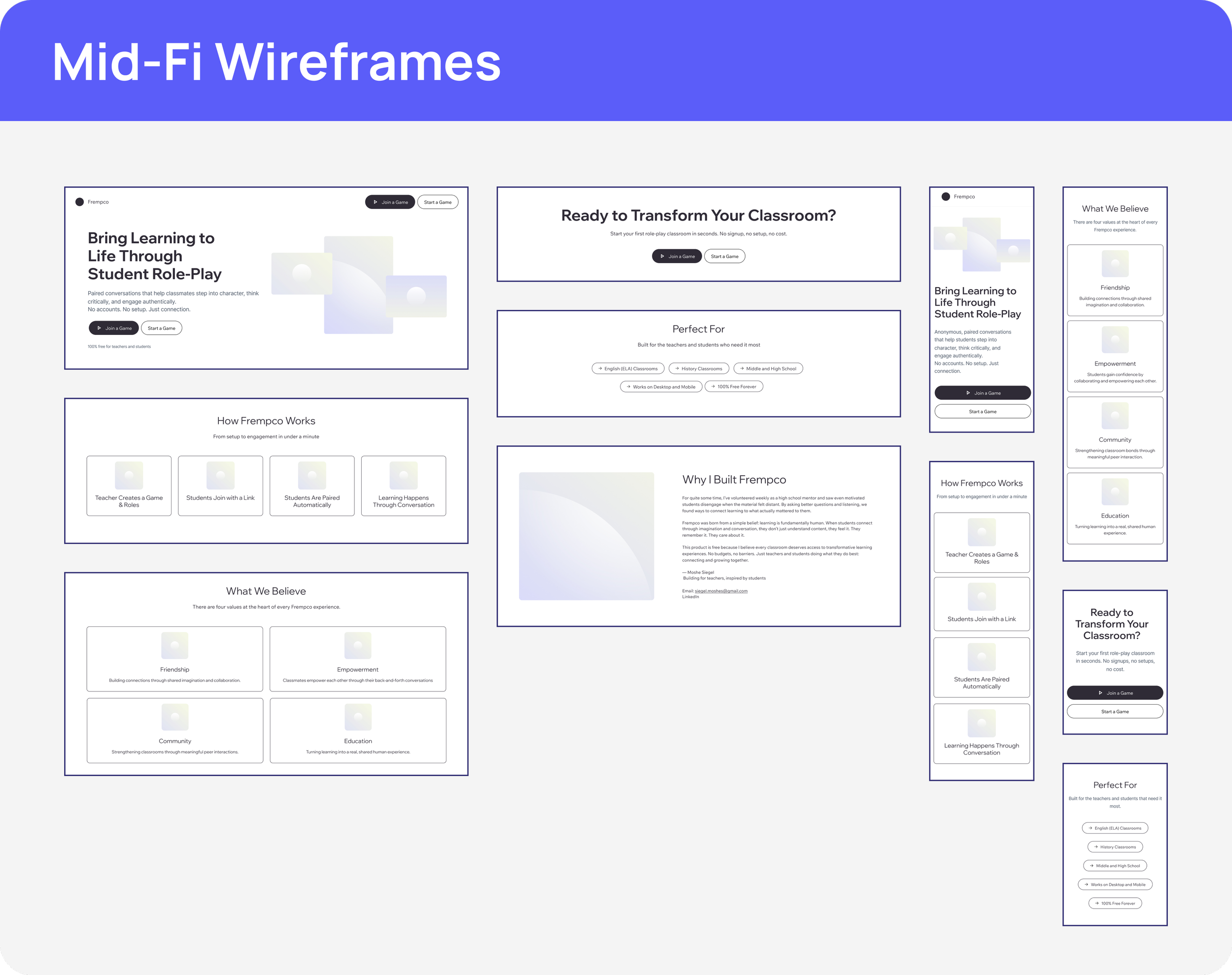
During the wireframing process, I decided to move directly to mid-level fidelity wireframes. The user flow for the teacher’s dashboard was already clear, and there was no need to explore multiple layout variations. This approach allowed me to focus on refining functionality and user experience while maintaining efficiency in the design process.

Testing for User Comfort

Before progressing beyond the mid-fidelity wireframes, I conducted user testing to ensure the layout met educators' needs and expectations. With 100% success across both tasks, we felt confident the design was intuitive and functional, allowing us to move directly to high-fidelity wireframes.

Branding Frempco

Building a Vision from Scratch

One of the most exciting aspects of this project was the opportunity to craft Frempco’s branding from the ground up. While the platform's foundational development was already in place, I had the unique privilege of shaping its visual identity. This process began with solidifying brand values- Friendship, Empowerment, Community, and Education- which became the cornerstone of every design decision.

From there, I aligned these values with a thoughtfully chosen color palette and created a brand logo that captured Frempco’s mission to transform classrooms into collaborative and engaging spaces. Throughout the process, I collaborated closely with other team members to ensure the branding stayed true to the developer’s vision while infusing the design with creativity and direction. This alignment between vision and execution brought Frempco’s identity to life, giving it a cohesive and impactful presence.

Going High Fidelity

With the flows and UI defined, I moved on to creating high-fidelity designs to validate the experience and ensure smoother testing. 

Usability Testing

Using Maze, I set up two user flows to test on my prototype.

Flow 1: Create a set from start to finish and save it for later

Usability testing of Flow 1 showed that most users intuitively accessed the “Create a Game” button from the dashboard, finding the interface clear and easy to use. While there was a 100% task success rate, a high misclick rate (72.4%) indicated some confusion—mainly due to unclear instructions around saving the game after starting it, suggesting a need for clearer, more segmented prompts.

Flow 2: Start a previously-made set with all students ready to participate and ensure all chats are activated

Usability testing of Flow 2 revealed that all users preferred the simplified “Start All Chats” button over manual options, confirming the effectiveness of consolidating confusing CTAs into a single, clear action.

Removing “Student Instructions” from the step sequence and repositioning it as a static element improved workflow clarity.

Despite a 100% task success rate, a 36.4% misclick rate indicated further refinements were needed on the game page to reduce errors.

Reducing Confusion in Task 2

To improve clarity and streamline the user experience, I made key changes to the game room page by repositioning the student instructions for constant visibility and consolidating the multiple CTA buttons into a single, clear action, significantly reducing confusion during task flow.

Reflection

Next Steps

  • Design of the student side of the platform

  • Creating the account and dashboard flows

  • Gradual addition of new features as development progresses

Working one-on-one with the developer and creator of Frempco was an exciting and invaluable opportunity to gain real-world experience designing for actual users and potential customers. It challenged me to balance creative solutions with collaboration, managing team members’ expectations and visions for the website’s design. I truly believe this responsive redesign will significantly increase user adoption while advancing both user and business goals.

Previous
Previous

Vendirect Case Study

Next
Next

WhatsApp Case Study