
WhatsApp Messenger
Designing a Child Lock feature for WhatsApp Video Calls.
Project Summary
Background
WhatsApp’s video call feature helps many families, especially those living abroad, stay connected, but for parents, calls with young kids often get cut short by accidental taps and chaos instead of bonding.
The Challenge
WhatsApp lacked a built-in way to disable screen interactions during calls. This project set out to design a seamless, parent-friendly “Child Lock” that works across platforms, fits naturally into the app, and helps families stay connected without stress.
Timeframe
3 weeks (July 2025)
My Role
Product Designer
Skills
Research
User flows
Wireframing
Visual design
Prototyping
Usability Testing
Tools
Figma
Fig Jam
Maze
Starting with Research
Because this feature was designed for an existing product, the research focused on how parents currently use video call platforms like WhatsApp, uncovering real behaviors, pain points, and workarounds to ensure the solution fit naturally into their habits.
User Interviews
User interviews highlighted key frustrations, like accidental hang-ups and screen tapping, that helped validate the need for a Child Lock and shaped the direction of the design. Key insights are summarized below.
Competitor Analysis
To guide the design, I analyzed both all-in-one messaging apps and niche platforms built for kid-friendly video calls. This helped me find the right balance between WhatsApp’s broad functionality and the more focused features needed to support families.
Who Are We Designing For?
I looked at both all-in-one messaging apps and kid-focused video call tools to understand what works well across the board. The goal was to design something that fits naturally into WhatsApp, while still offering the kind of screen control and safety features families really need.
Bridging Research to Action
Project Goals
I mapped out what the feature needed to achieve for both parents and WhatsApp, making sure every design decision balanced user needs, product goals, and technical constraints.
User Flow
With clear goals in place, I created a user flow to map how people might use the feature and identify the key screens to bring into wireframing.
Exploring the Flow
To start bringing the feature to life, I created low- to mid-fidelity wireframes to explore how it would fit into WhatsApp’s interface, test layout ideas, and map out interactions before moving into high-fidelity design.
Fitting it into the System
Before moving into high-fidelity designs, I built a custom UI kit using WhatsApp’s colors, fonts, and components to keep the feature consistent and native to the app.
Making it Real
With the foundation set, I moved into high-fidelity designs to bring the feature to life, staying true to WhatsApp’s interface while introducing new functionality.
*While “swipe to unlock” was used in this prototype, it was a workaround due to Figma's prototyping limitations. The original concept involved a press-and-hold gesture, which was more aligned with the goal of reducing accidental unlocks.
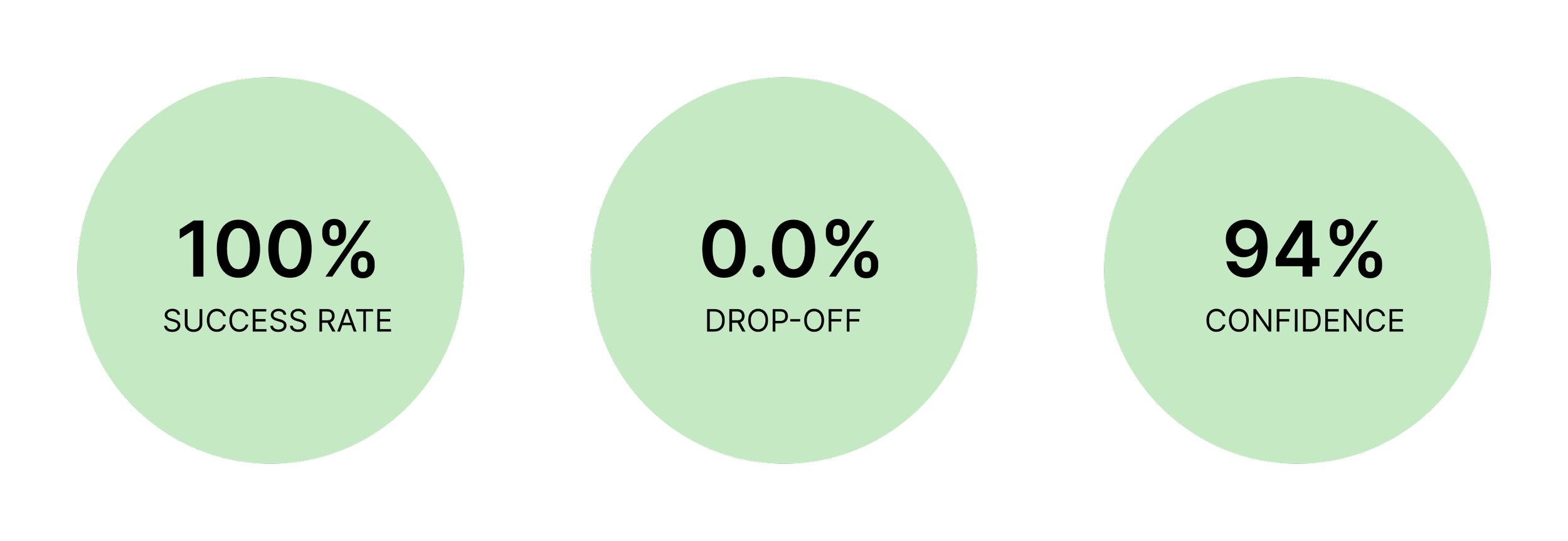
Testing the Flow
To test the feature’s clarity and usability, I ran a Maze test with 7 active WhatsApp users, giving them one simple, realistic task to see how naturally they moved through the flow.
Imagine you want to video call Grandma with your baby or toddler. Start a video call and then try using Child Lock to freeze the screen so your toddler can’t mess up anything. Then, once you're ready, turn off Child Lock and return to the regular video call.”
User Feedback
“I love my kid but I hate when they use my phone when I call family… this solves my issue!”
“I need this (feature) NOW!”
“This (feature) may actually entice me to call my parents more often so they can see my kids if I know they won’t ruin the call!”
Future Testing
For this round, I tested a single flow to keep things simple, but future iterations could separate turning Child Lock on and off, along with A/B testing when users prefer to activate it— before or during a call.
Iterating on the Design
In early testing, users said the prototype wasn’t working, until I saw one tap the full video call bar instead of the icon. I updated the button to be fully clickable, a reminder that design issues can come from assumptions, not errors.
Adding the “Yes” Users Expected
After testing, I added a “Yes, Show Me How” button to the bottom sheet since users expected a clearer option than just “Maybe Later,” even though the link was meant to guide them.
Reflection
This project showed how a small, focused feature can make a meaningful difference when thoughtfully designed. It reinforced the value of observing real behavior, working within constraints, and designing with empathy for everyday moments.
Next Steps
Design an Android-specific version using native tools like App Pinning
Integrate optional onboarding or in-app guidance for first-time users
Consider adding customizable settings, like auto-lock timers or pre-call preferences, to give parents more control