
Vendirect
A complete mobile directory solution helping gap year students and parents find trusted services, fast.
Project Summary
Background
Vendirect is a proof of concept end-to-end mobile app built as a natural extension of IsraelGapYear’s trusted platform, aiming to centralize essential services for gap year students and their parents. It brings everything from SIM cards and restaurants to laundry and medical care into one easy-to-use, reliable hub.
The Challenge
Families currently rely on scattered Facebook groups, word-of-mouth, and outdated resources, while local businesses struggle to reach this audience—creating a clear need for a trustworthy, intuitive directory that solves real gaps rather than adding another “nice-to-have” tool.
Timeframe
5 weeks (July-August 2025)
My Role
Product Designer (with prior role as Digital Marketing Manager at IsraelGapYear)
Skills
Research
User flows
Wireframing
Visual design
Branding
Prototyping
Usability Testing
Tools
Figma
Fig Jam
Google Forms
Maze
Starting with Research
Coming into this project, I already understood IsraelGapYear’s audience from my work as Design Lead, but it was still essential to move beyond assumptions and clarify who would truly benefit from a directory app and ensuring the features solved real pain points, not just adding a “nice-to-have” tool.
User Surveys
I used surveys as the quickest way to gather broad insights, supported by a few informal interviews for context. The surveys were short, focused, and highly effective, leading to clear patterns and key insights through deeper analysis and affinity mapping.
Competitor Analysis
A competitor analysis helped reveal gaps in similar platforms and clarify what Vendirect needed to do differently to stand out and address unmet user needs.
Setting the Priorities Straight
At this stage, it was all about focusing on what really mattered for launch and making sure the app stayed simple, practical, and built around the most important needs first.
Project Goals
Clarifying project goals made it possible to connect what gap year families truly need with what IsraelGapYear as a business must achieve, creating a focused foundation for Vendirect’s design.
From Core Needs to Future Growth
I narrowed the launch to essential features like searching, filtering, saving favorites, and direct contact, while reserving advanced tools like recommendations and community features for future growth.
App Map
With features prioritized, an app map clarified Vendirect’s structure by defining each screen’s purpose and connections, ensuring the MVP stayed intuitive and aligned with project goals.
User Flow
A flow was created to outline how users would search within a category, apply filters to narrow results, and save a business for later. While flows were also created for onboarding and other key actions, this one is highlighted here as the most critical path and the focus of usability testing which would be tackled later.
Exploring the Flow
It was now time to begin bringing Vendirect to life.
Beginning with Sketches
Low-fidelity sketching was essential for mapping the full scope of an end-to-end app like Vendirect, letting me explore many screens quickly before moving into deeper design.
Moving up in Fidelity
Mid-fidelity wireframes let me refine structure and validate the flows without visual noise, making sure the app worked the way it should before moving into polished high-fidelity design.
Branding Vendirect
Building a Vision from Scratch
Because Vendirect was built with long-term potential, branding became essential. It needed an identity connected to IsraelGapYear but strong enough to stand on its own, allowing it to scale or expand in the future.
A full visual system including logo, colors, typography, style tile, and a custom UI kit was created from scratch to ensure consistency and set the foundation for growth.
Going High Fidelity
The high-fidelity designs brought Vendirect’s UI to life, turning the branding and UI kit into polished screens. These were continuously refined through feedback and testing to ensure strong usability and visual consistency.
Testing the Flow
To test the feature’s usability, I ran a remote Maze test with 10 participants and three simple tasks, allowing me to observe how naturally users moved through the core flow and whether it felt clear and seamless.
Task 1:
“You are the parent of a gap year student living in Israel. You’d like to order food to be delivered to your child’s dorm. Navigate to where you would find businesses that sell food.”
Task 2:
“Your child is studying in Jerusalem AND has food allergies. Show me how you’d filter the Catering & Food vendors to find the ones that work for them.”
Task 3:
“You’ve decided you want to learn more about "SafeBites Israel". Please look at their business page and add it to your favorites so you can easily find it later.”
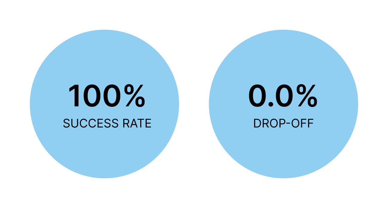
Analysis
All tasks had a 100% success rate, confirming the flow was intuitive, but a high misclick rate, especially the 41.2% in the final task, showed clear opportunities to refine interactions and reduce confusion.
Small Changes, Big Impact
Based on usability feedback, small but important iterations were made such as switching the heart icons to a clearer bookmark symbol and adjusting the bottom sheet interaction so that saving a business felt more intuitive, especially for less tech-familiar users.
Future Testing
Looking ahead, more usability sessions would be run on areas not yet tested, such as onboarding, profile pages, the forum, and accessing saved items. Exploring these flows would uncover new insights and ensure the experience feels seamless end-to-end.
Reflection
Working on Vendirect let me return to a company I knew, but in a completely new role. Designing an end-to-end product from scratch revealed both the challenges and potential of the idea, and even though this case study focuses on the design phase, the opportunity for Vendirect to impact an untapped market is huge.
Next Steps
Expand usability testing to onboarding, profiles, forum, and saved items
Explore additional features beyond the MVP, such as recommendations and community tools
Test scalability for other audiences and potential new markets
Collaborate with developers to bring designs into a functional prototype